In the past I never gave too much thought to the design of my web applications. Lived by the motto “if it succeeds I’ll hire a designer”. This time I’m taking a different approach. Mainly because I really believe that we are building something big.
But how do you go around designing a web application. I’m not a designer and have worked with enough to know you don’t just explain the idea, off they go and come back with awesomeness. The best results came after I had put a lot of thought into the problem myself.
In this new venture we have access to a UX expert and I have experience with a handful of UI designers. So the basic idea is to mockup everything, iterate on the UX and once that is done we hand over to designers.
My task today is to mockup the start page. Clearly the most important page of all, so I am trying to be as structured (and therefore comprehendable for my team) as possible. To start off I defined what different kind of users are coming to this page. They have different goals that all need to be catered for. But how do you put that all on one page? So why not look at apps and site I frequently use. Learn from the best, right?
I’ve focussed on services with a download and with a secured content area since this is closest to what we are building. For these kind of apps the start page serves three user types:
- NewGuy: Wants to know what it is.
- Adopter: Wants the software or wants to create an account.
- User: Wants access to the secured area.
Dropbox
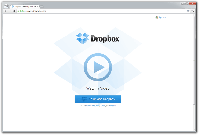
First impression: Lot’s of white space.
- New Guy: One click plays the video, 40 seconds later you know enough.
- Adopter:
- One click leads to the right download (determines OS automatically).
- Account creation link is not directly visible. But I guess most users will create the account in the app after download.
- User: Two clicks in total, username & password entry.
One thing I noticed is that if you press tab the login window popups automatically and you can only tab to password and the “Sign in” button. Using the keyboard you cannot proceed to “play the video” or “download”. Are they assuming that power users are the ones that use a “tab” and don’t need the other two features? Also what about accessibility?
Evernote
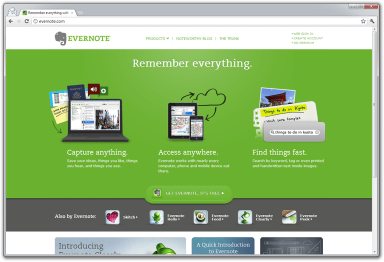
First impression: A lot of elements on the page. The download button almost dissapears in the green.
- New Guy: Main features are visible immediately.
- Adopter: One click leads to the right download (determines OS automatically) and one click for account creation.
- User: Two clicks in total, a page reload and username & password entry.
Interestingly the homepage displays a feature set instead of the problem they solve. As a user myself I would have gone with “Save anything you think you might need in the future” & “find that one thing you know you saved with just a couple of words you remember”.
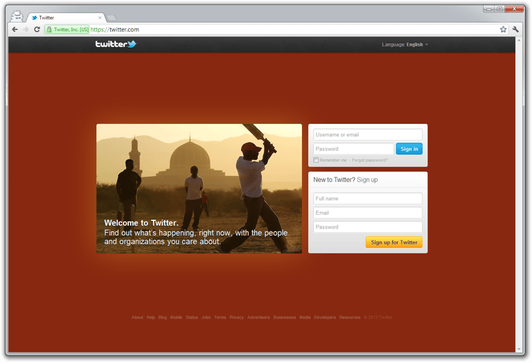
I hadn’t seen the new homepage before, so this is a quite genuine first impression: “This could just as well be a pay wall to a news site”. Would you think that if you had no idea what Twitter is?
- New Guy: The value description is too broad and applies more prominently with classic media sites. Clicking on the picture doesn’t do anything. There is a small “About” button which leads to a lot of text and somewhere in there is the Twitter video.
- Adopter: 3 Fields and you’re good to go. Since the desktop experience is the web site you don’t need to download anything. Thankfully*.
- User: Username, password and you’re in.
The twitter video has no voice-over and centers on the experience. Sure it creates emotions and a feeling of “ooh I want that too”, but does it show how it differentiates itself from Facebook?
*To download an app from the website: guess and find the link called “Mobile”, send e-mail to myself, then click on link in e-mail to get to the right app store. Four clicks at least.
Spotify
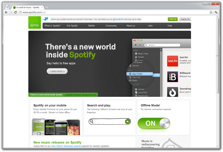
First impression: This is an app store. I can’t believe there biggest element conveys this message. Even the second image which appears a few seconds only talks about trying the premium for 30 days. The premium of what exactly?
- New Guy: If you do click on “What is spotify” then the message is clearer: “search for music, play anywhere”.
- Adopter: With “Get Spotify” you’re there in two clicks.
- User: 2-3 clicks depending on how you log-in.
I love Spotify and hate to see this as their start page. Sadly it’s the same experience in all countries that I tried. They just translate the “app store” announcement.
Google Chrome Browser
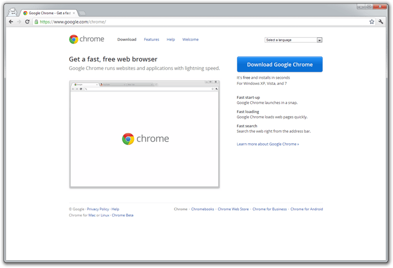
First impression: Sure it’s minimalistic, but is the empty browser window that covers a large part of the page necessary? Older versions even had content in that screenshot. My focus is certainly directed towards “fast, free” and the blue download button.
- New Guy: It’s a fast, free web browser. Says it right there.
- Adopter: One click to download.
- User: not applicable.
That blue button just jumps at you. If this was there only product they could have gotten rid of a lot more elements on the page, but it doesn’t look cluttered at all.
Other examples
Nozbe
First impression is the site’s pages are little too dense with information. Targeted at GTD users the start page slogan “simply get everything done” is recognized immediately. On the sign-up page you are led to think you need to choose a plan even though you don’t.
Trello
The video is Joel demo-ing the app, with lot’s of aehms and uhms, but it’s very natural and great to watch. I actually immediately made myself a task to create another board for our project.
The one think I thought I liked was the search box. I didn’t know if they already had a mobile app for Trello but searching for mobile app leads me to strange looking search results. It’s actually a search across the public trello boards and not a search on the Trello site itself.
Take-aways for us
1. A basic value proposition on the first page
Three illustrations on what we offer that leave no confusion. This will take a lot of time to get right, but it’s essential for grabbing the attention of visitors. Focus on the problem you solve and not the features.
Follow-up with a natural video taking you through a basic case and 1-2 more complex use cases.
2. Immediate log-in
Most of the apps show you the secured area immediately (if you have the appropriate cookie). If that can’t be done I prefer username and password fields to be at most one click away, but certainly not require a new page to load.
3. Don’t make the user choose
If possible figure out what the user needs to download. If you can use the referrer to determine what the incoming user is most probably looking for adapt the experience to that.
4. Demo account / screenshots
Hardly any of the sites I looked at had any kind of demo account. When I download tools or utilities I always search for the screenshots of the application first. For online apps I would expect to see a demo account that I can look at immediately (which to be fair many business web application do have).
5. Make sure every action has a reason and is clear
Last but certainly not least. Anything on that first page needs to be there for a reason. It has to be clear to everyone what it means. Test, ask and observer what people do. Reason enough to keep the elements on the first page to a minimum so that testing does not get out of hand.